PrAnaViz
Introduction
The aim of this tool is to visualize and analyze the prescription data to calculate total prescribed quantity of different APIs and to explore spatiotemporal trends of different APIs at Clinical Commissioning Group (CCG) regions with resolution to individual postcode. Note: The demo version of the tool hosted in the link present only Bath and North East Somerset CCG dataset.
We have created, PrAnaViz, in a familiar browser-based dashboard layout that most users are familiar with from typical websites and online tools. The basis functionality of PrAnaViz is filtering datasets and producing graphs according to selection criteria defined by the user.
PrAnaViz grouped into two panels (1) Targeted API, (2) Non-targeted API, that each consist of two to three output boxes displaying the results. Users can navigate between different panels through clicking the respective option in the sidebar. And the user-defined selection can be downloaded in a .pdf or .eps and data as .csv format for further analysis.
Targeted Panel
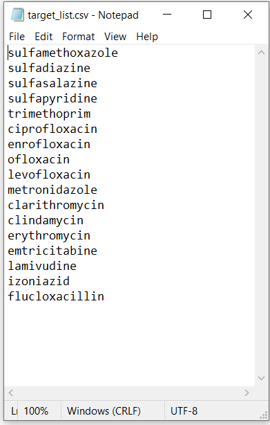
In this panel, user can input a list of APIs in .csv format as in the Figure:4.1, and find out the total prescription quantity of each API in the selected year, at the selected CCG region, and 5 different selection criteria can be found in this panel as in Table 1.
| Criteria | Functionality |
|---|---|
| Upload targets | Upload target list, i.e., APIs in .csv format |
| Select Prescription Year | Select the prescription year of interest |
| Select Region | Select the CCG region of interest |
| Select Graph Type | Define the output as total prescription for the year or month wise prescription |
| Setting Type | Select the General Practice setting type |
Table 1. Selection criteria in Targeted Panel
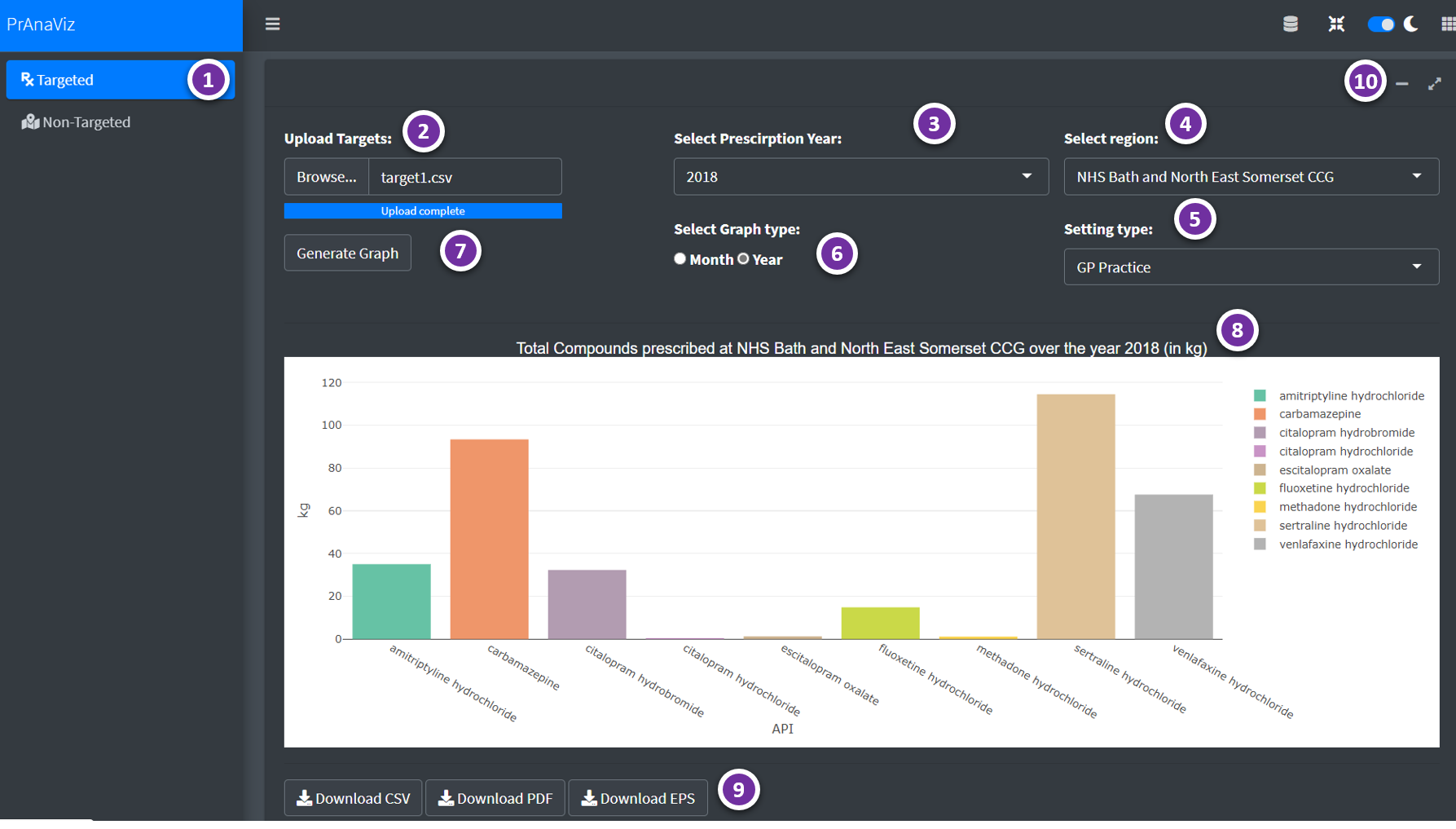
All output is based on the selection criteria defined by the user in the panel. Each new selection and any change needs to be confirmed by clicking the Generate Graph button. Results are shown in a bar chart or a line chart based on the user selection criteria (Select Graph Type) as in the Figure:4.2.
The bottom portion of this panel visualize the total quantity of a selected API prescribed by month, GP, Chemical form, and Medicinal form for a CCG region in a selected year, these line plots will be generated by clicking an API in the Bar Chart.
User can download data as .csv file and publication ready image .eps and .pdf files.
 Figure:4.2: PrAnaViz Targeted Panel.
| Option | Remarks |
|---|---|
| 1 | Select Targeted or Non-Targeted Panel |
| 2 | Upload targets i.e., APIs in .csv format |
| 3 | Select Year |
| 4 | Select Region |
| 5 | Select Setting Type |
| 6 | Select month-wise or year-wise plots |
| 7 | Action button to generate the plot |
| 8 | Plot generated based on user selection |
| 9 | Download buttons to download the generated plot as .pdf or .eps and data as .csv format |
| 10 | Maximize and minimize the tab |
| 11 | More insights on a selected API, visualize total prescribed quantity of the API per month, GP practice, postcode and medicinal form (click on a particular API on the barplot to generate these plots) |
| 12 | Download buttons to download the generated plot as .pdf or .eps and data as .csv format |
| 13 | Maximize and minimize the tab |
Non-targeted Panel
Total prescription quantity of an individual API at different postcode per month at a CCG region, can be rendered in this panel.
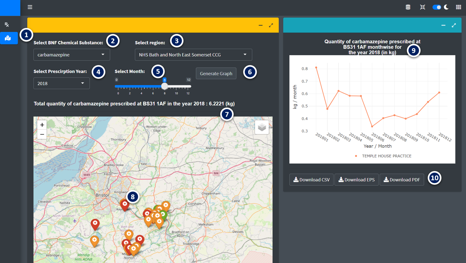
All output is based on the selection criteria defined by the user in the panel (Table 2). Each new selection and any change needs to be confirmed by clicking the Generate Graph button. The calculated total prescription quantity of an individual API at postcode level helps to find the hotspots as in the Figure: 4.3.
| Criteria | Functionality |
|---|---|
| Select BNF Chemical substance | Select API of interest |
| Select Region | Select the CCG region of interest |
| Select Prescription Year | Select the prescription year of interest |
| Select Month | Define the output as total prescription for the year or month wise prescription |
Table 2. Selection criteria in Non-Targeted Panel
 Figure:4.3: Non-targeted Panel.
| Option | Remarks |
|---|---|
| 1 | Select Targeted or Non-Targeted Panel |
| 2 | Select API in the drop-down menu |
| 3 | Select Region |
| 4 | Select Year |
| 5 | Select a month |
| 6 | Button to generate the plot |
| 7 | Plot generated based on user selection, click on a particular postcode to generate further plots |
| 8 | click on a particular postoode on the plot to generate these plots) |
| 9 | Visualize the total prescribed quantity of the API per month on the selected postcode |
| 10 | Download buttons to download the generated plot as .pdf or .eps and data as .csv format |
